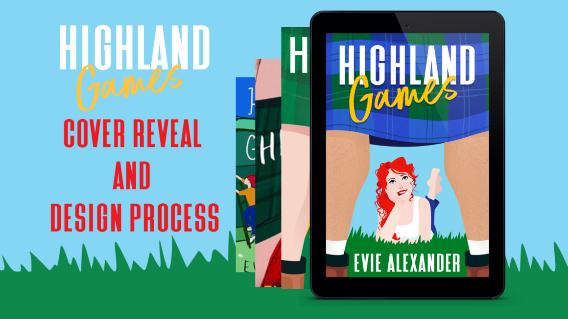
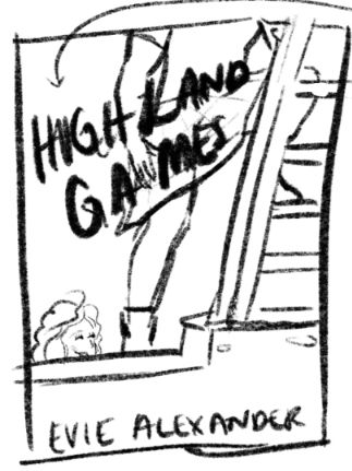
Highland Games Cover Reveal and Design Process
Here it is! The cover reveal for Highland Games! Having a cover designed for your books is one of the most exciting parts of the whole publishing journey and this blog takes you through every step, from initial ideas and inspiration to the finished product. Step behind the scenes and check out the cover design process!
Having control over your covers is the most exhilarating and nerve-wracking of experiences. On the one hand, you can get exactly what you want, but on the other, if the covers aren’t hitting the mark with readers then you’ve got no-one to blame but yourself…
The cover of a book is its most important selling point. It’s usually the first contact a reader will have with your work. Unless you’re J.K. Rowling, where the name will sell before anything else, or you have an existing loyal and dedicated readership, people will usually come across your book whilst scrolling online. The cover will be thumbnail size, and readers need to know subconsciously and immediately if this might be a book they would enjoy. I predominantly read romance, and when I’m in a bookshop my eye will pass over thrillers and horror. The covers tell me what genre they are, and so I know they are not what I’m looking for and move on.
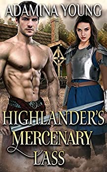
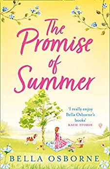
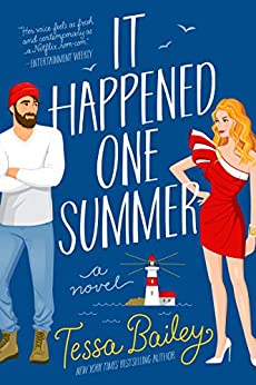
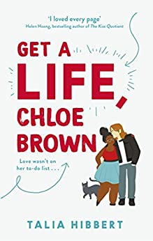
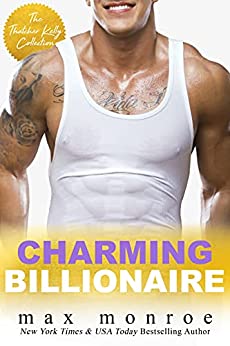
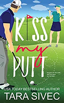
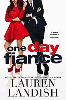
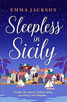
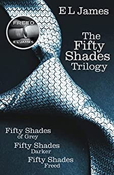
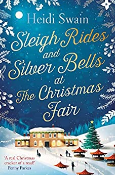
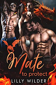
Within the romance genre there are many different sub-genres and styles of cover. Here are a few examples:
Highland Games is a steamy contemporary romantic comedy so I could have gone for a photographic or an illustrated cover. I chose to have illustrated as the British romance market is almost exclusively illustrated covers. I also chose to commission the cover rather than try and do it myself. I’m a writer, not an artist or graphic designer, and wanted a professional to make sure my book had the best chance of being noticed.
When choosing a cover designer I did a lot of research online in Facebook groups, on job sites, and by researching covers I liked and finding who the designers were. I decided on Bailey McGinn because I had seen her work, knew she would keep going until the design was right, and I had talked to authors who had used her services and were very happy with her work. I also wanted a designer who could do all the covers for the Kinloch series so there was continuity, and who would also read my books so they understood who I was as a writer.
The biggest issue I had when I started the process was that I knew I wanted an illustrated cover, but didn’t have any examples of covers I absolutely loved to show Bailey. I also didn’t have a clue what I wanted for the cover of Highland Games…
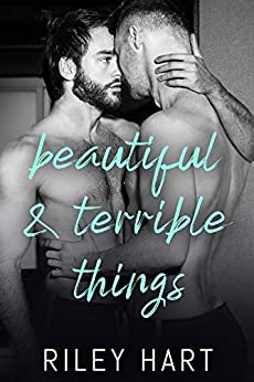
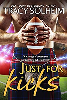
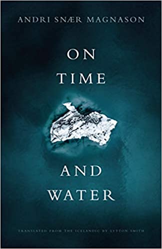
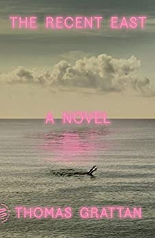
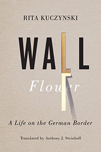
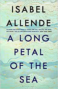
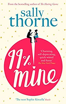
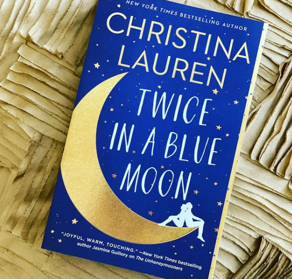
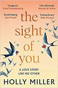
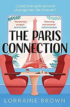
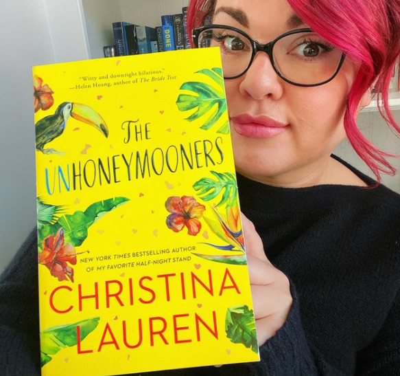
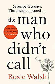
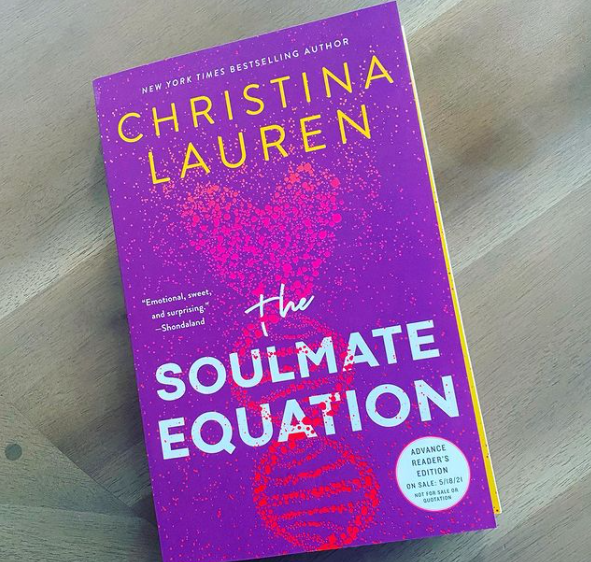
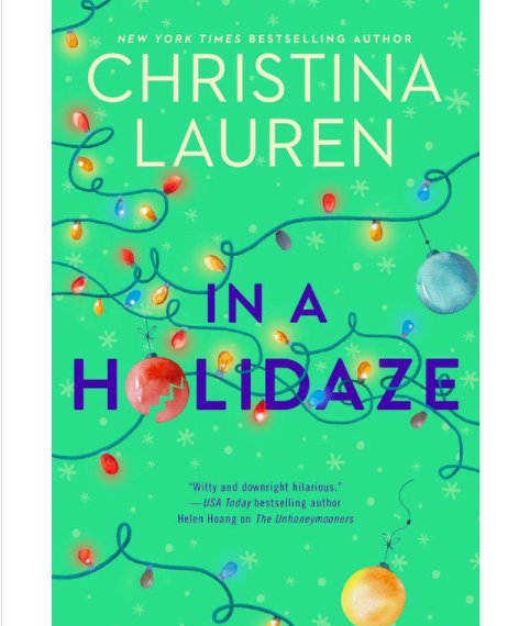
Covers that I absolutely wet my pants over are completely and utterly unsuitable for romance novels. My book cover porn site is The Casual Optimist, however none of the covers he features would be appropriate for selling a contemporary romantic comedy. Below are four of my favourites:
How the cover design process started
In February 2021 I began chatting with Bailey, and at the beginning of March I sent her the manuscript for Highland Games and a brief. We then had a zoom call and discussed what I liked, didn’t like, and what I had included in the brief. I also paid her up front for all four covers even though at the time I hadn’t started writing book four.
Part of my brief:
‘I don’t want anything photographic. I don’t want an image of a woman in the distance walking off into the glen or standing winsomely in front of a castle. I don’t want anything twee or cutesy. I don’t want anything ‘mumsy’ and it can’t have a historical vibe. I need to find an audience that won’t be horrified by hot sex scenes or my potty mouth, but also would be comfortable reading the paperback in public. I want the spine and back cover to be part of the design and all covers to be recognisable as part of the same series.’
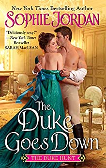
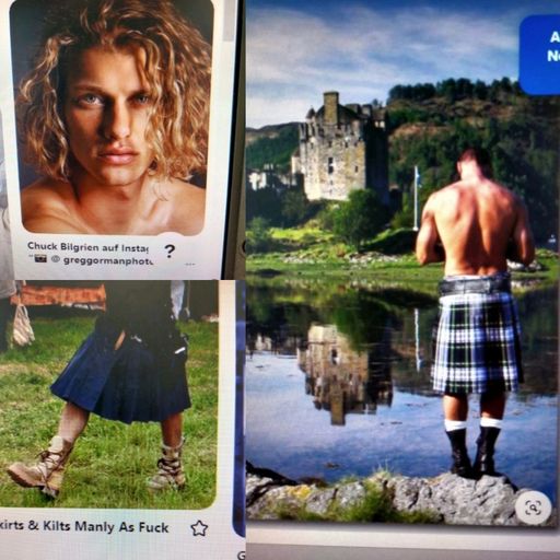
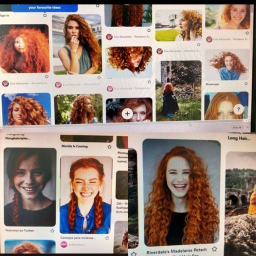
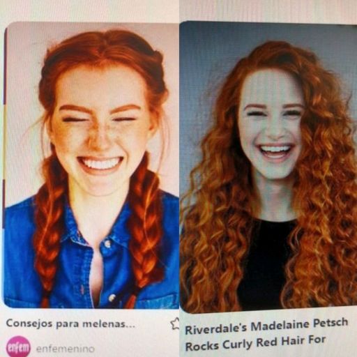
The covers that I liked and sent to her, although didn’t necessarily feel were right for Highland Games were these:
With the cover for Highland Games, I wanted it to immediately be seen as a romance novel, and to convey the cheekiness of the story. What I didn’t want was something that might be picked up by someone who would be offended by ‘earthy’ language and on-the-page sex. My friend and fellow author Margaret Amatt is also an artist and graphic designer, and mocked up this cover as an example of what I wasn’t looking for.
First design comes in
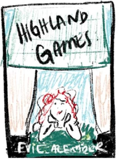
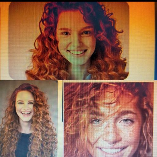
Bailey’s first design focussed on Zoe, the castle, and a key scene in the book where she climbs a tree. However I wanted both Zoe and Rory on the cover, and sketched out some designs based on Bailey’s first sketch, with Zoe at the bottom of the cover looking up Rory’s kilt. I also took some selfies and tried to mock up what I wanted Zoe’s hair to look like…
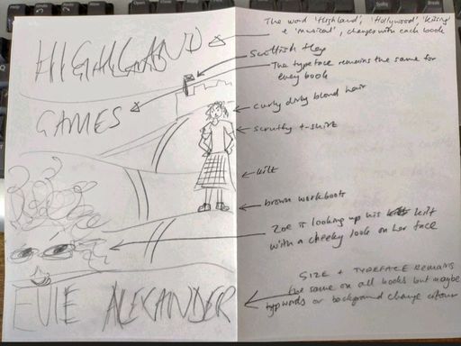
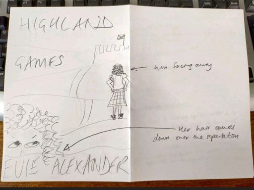
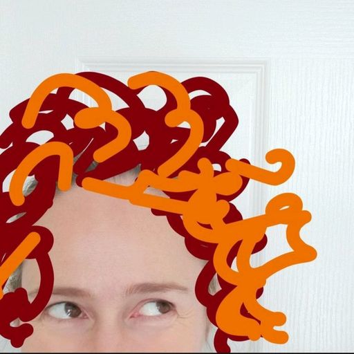
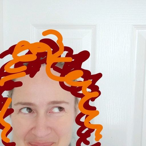
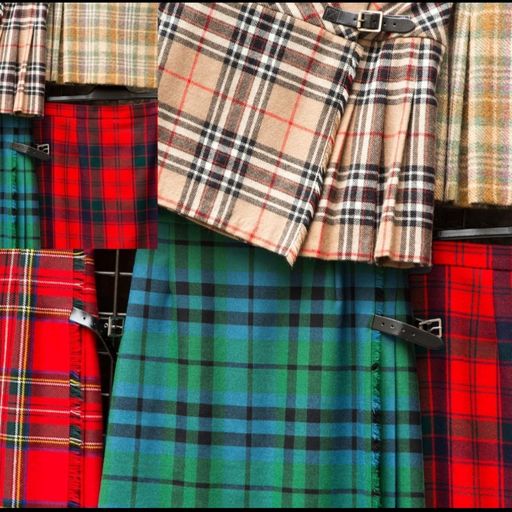
‘The ideas are written out on my crappy drawings, but to summarise: The words ‘Games’ and Evie Alexander will remain pretty much the same for each book, but the ‘Highland’, ‘Hollywood’, Kissing’ and ‘Musical’ will be different each time. I think it would be a nice idea to have his kilt lifting up with the wind a bit like Marilyn Monroe in The Seven Year Itch so she can more easily see under it. The idea is that she’s trying to peek under his kilt. Hopefully this will sell the idea of cheeky Scottish romance. Plus also use of colours, kilt, maybe a Highland cow, the Scottish flag etc etc.’
This was Bailey’s reply:
‘That’s so funny you mention the kilt idea, It’s one of my sketches! I’ll reply more thoroughly tomorrow, I just loved that you sent that idea. I VERY much appreciate that you included a photo of yourself with drawn on curly red hair for reference. I didn’t quite pee but I had a good chuckle. It’s going on the mood board for sure. The rest are perfect references, thank you.’
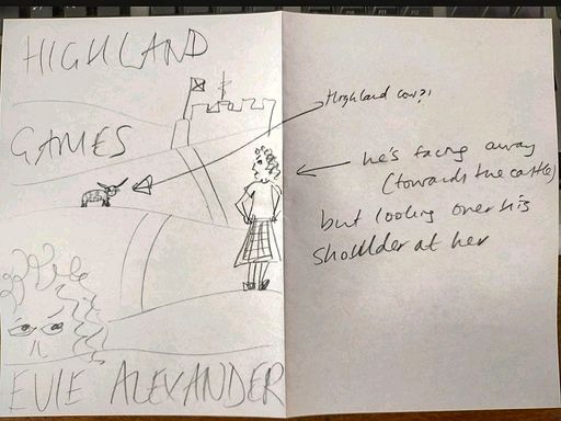
The next day, Bailey sent through two sketches, one of Zoe on the ground looking up Rory’s kilt, and the other looking up his kilt whilst he climbed a ladder.
We then scheduled a Zoom call to discuss ideas for all four book covers, and a design bailey had further mocked up of the image of Rory climbing the ladder.
I said that my favourite idea was the one of her on the ground looking up his kilt and so we decided to go with that image and work with it.
First mock-up of final design
Now we knew the design we were going to work with, Bailey got back to the drawing board and the first idea came through:
I loved this concept. I sent it to a couple of close friends and we discussed what direction I wanted it to go in. One of them took the image and added some blue to the kilt, added socks and made his legs a bit more defined and browner. Here is more of my feedback:
‘1) the word ‘games’ – loving the playfulness of the way you have written it, but it’s feeling a little bit restricted. Is it possible to close off the g and open the word ‘games’ up slightly to make it a bit bigger and perhaps tilt it slightly more. Not sure if g works as a G, maybe something to try.
2) Kilt – My friend introduced a bit of blue. If you think the blue jumps too much or interrupts the writing, it can be toned down (it’s a really rough version). Also, maybe red can be used instead of blue, or a mix of the two. I would like the pattern to be more kilt-like in design. The colours can still remain subtle but it would be good if it was more obviously a kilt pattern. The black line under the kilt that indicates the inside of the front part of the kilt, could we try this in a darker colour (of the actual kilt) that makes it feel a bit more like a part of the kilt? I want it to really feel that there is this cavity under his kilt that she is looking up.
3) Rory’s legs – You will see my friend has made the overall colour more similar, so they read as a singular volume (less contrast between the stripes). I think this makes the legs more solid and readable as legs. Perhaps the colour of the legs could be ever so slightly warmed up as her version is too brown. We need them to release from the yellow negative space. She also added white socks to help the boots be read as boots. See what the legs look like without the horizontal stripe at the top of the legs to see if it works, or if the composition becomes too vertically fast. She also made the legs look more muscular so maybe have a play around with this
4) Zoe’s hair. Loving her hair, but it is possible to try and make her hair way more curly as per how she is described in the book. However I don’t want the hair to distract from her expression which is great!!!!’
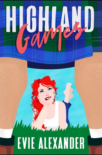
Second iteration of final design
From Bailey:
‘I hope you’re doing well! I have a few versions to show you, the biggest changes being of course colour options! I’ve been playing around a lot with different palettes. I have found that adding additional colours to the kilt gets a little too busy so I think it’s best to keep the kilt fairly monotone.
I also updated the fonts. What do you think? I feel like the “highland” font is a little more modern and somehow sexier than the last one I used? I’ve played with giving it a bit of a shadow (see blue and red) to help it pop as a thumbnail. I actually think the blue kilt is perhaps the most effective in this regard.
Other general changes: added more curls to Zoe’s hair, switched author font and moved to one line (feels cleaner?), added a more traditional kilt pattern while keeping it simple, also added a fold in the fabric for movement, updated his leg colour and faded out the leg shadow a bit, added socks (too high?).
Let me know what you think of these new options.’
My feedback:
‘Fantastic! I want to work on the blue kilt and red HIGHLAND writing. I felt the red kilt took too much away from her hair, although many people liked it. And I wasn’t sure about the shade of green on HIGHLAND on the other blue kilt design, although (again), many people loved it. I liked the green kilt but I don’t like the yellow background behind Zoe – again a few people LOVED this one!
1) socks – yes need to go lower
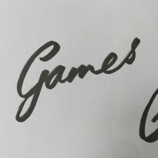
2) the ‘g’ of games looks like a j. Can you try it upper case?
3) His legs – need to be a little browner. can you try also putting more detail on them so they look hairy and therefore definitely male
4) her face – can we try with some freckles across her nose and cheeks
5) Kilt – most people who saw this and had no context (they didn’t know I’ve written a book) took a while to clock that it was a kilt. Can there be a little more definition in it – maybe bigger contrast between the shades, and can you try a tiny bit of green in the kilt, even if it just some thin lines
6) The red of HIGHLAND doesn’t seem to pop enough. Could you try it lighter and/or with a drop shadow as per the red kilt design. Can you try the drop shadow darker and also lighter? I wondered if the drop shadow could be white? Might look shit, I can’t tell in my head…
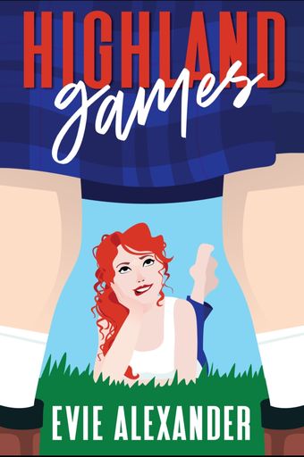
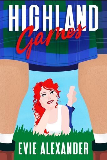
Third iteration of final design
From Bailey:
‘What do you think about this update? I made a few significant changes including handwriting “highland”…what do you think of this style? I love the hairy legs. I added texture throughout and really worked on making the tartan recognisable. One more update! Just added a little depth and darkness behind the title to give it more clarity.’
My feedback:
‘I think the finishing stroke of the m of Games looks like blood dripping down the page to me (I know, weird brain). Could it be shortened and possibly added to the ‘e’. Can you also make the shade back to the same colour (or near as poss) to her hair, as the lighter colour isn’t looking as strong as I’d like. I still think it needs a drop shadow to help it pop out. If that doesn’t work can you have another tinker with the colour? I don’t know if you can add the G of Games to the rest of the word? I’ve drawn a (shitty) example and attached it to this email so you can see the idea.’
‘I like the depth and darkness behind the letters to help them pop out, but can we try going back to the cleaner version of HIGHLAND (still with the drop shadow) so it mirrors the cleanness of Evie Alexander? Can we also try with the sky back to the shade in the last version?’
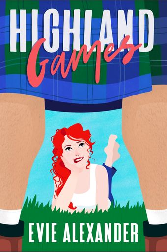
Fourth iteration of final design
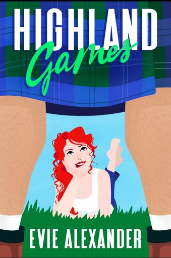
My feedback:
‘1) Can the blue sky background go back to exactly the same tone as before as it is still a little too greeny for me.
2) Can we work on the yellow, light blue and dark red writing – 3/5/7.
3) Some other suggestions:
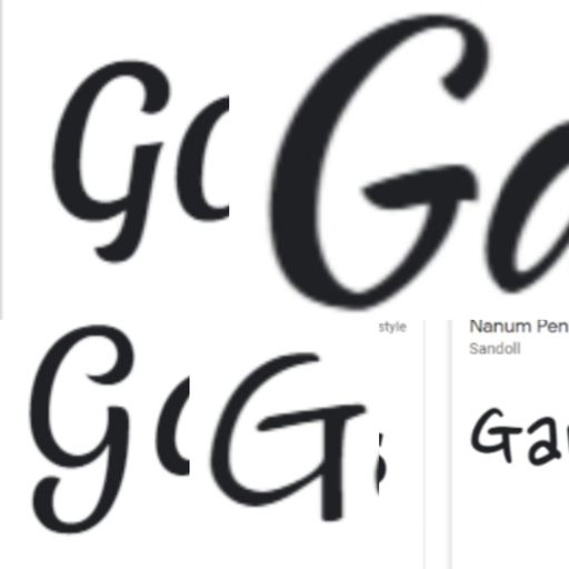
– the G to some people is reading as a C and a couple of people thought the word read Carnes. I have attached some ideas about how it could be adapted
– make the word games a little bigger, and if it is going past the bottom of the kilt, maybe tilt it so it is more parallel with the word HIGHLAND.’
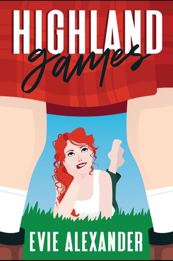
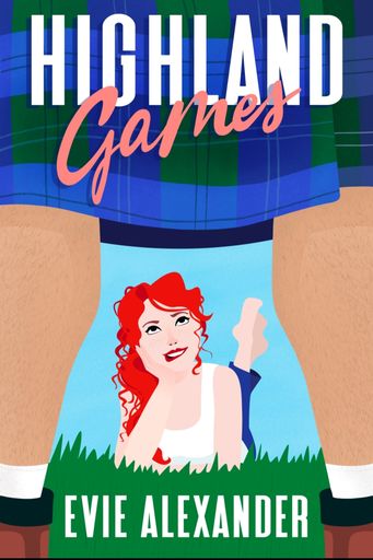
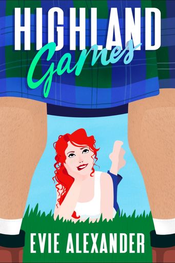
Fifth iteration of final design
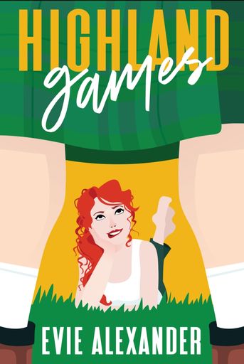
At this point we were so nearly there! Bailey sent through three more versions with ‘Games’ in red, blue, and yellow and three different fonts.
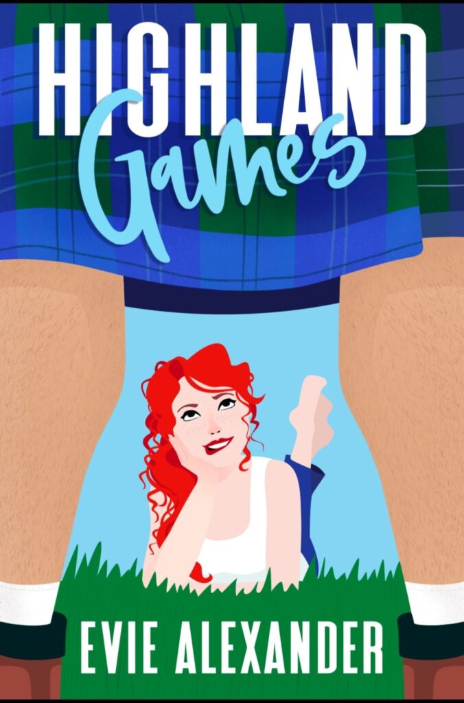
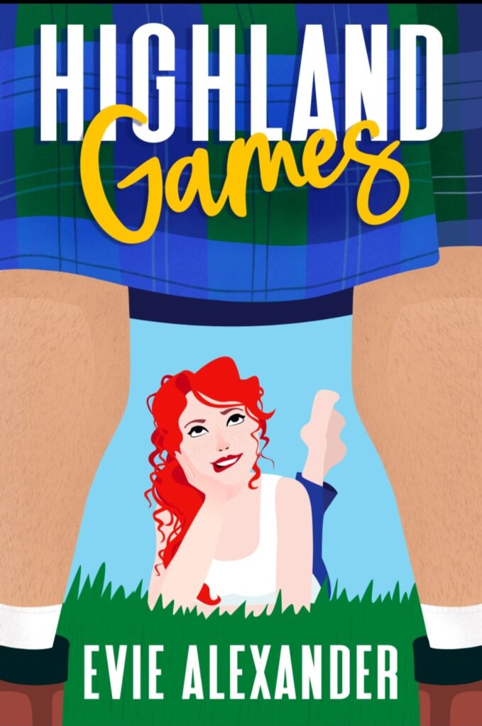
My reply was ’Red lettering on games but in yellow colour please!!!’
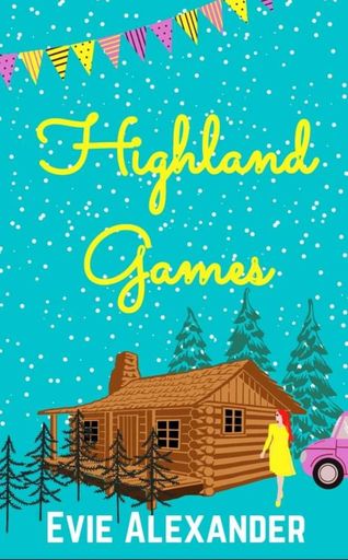
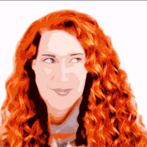
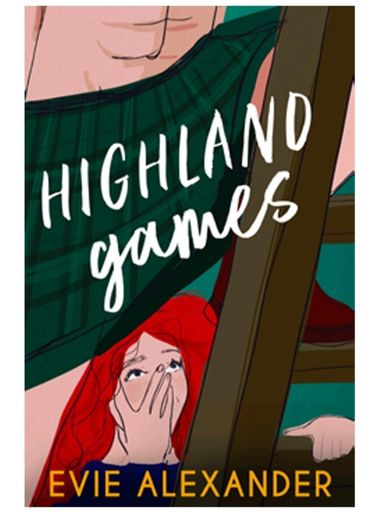
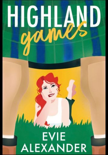
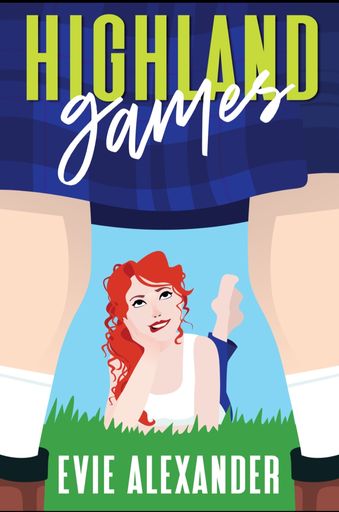
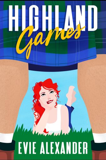
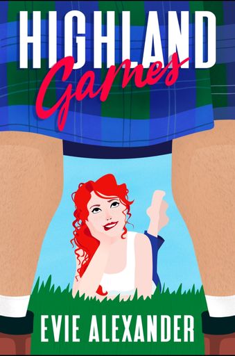
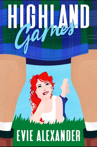
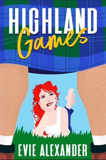
Front cover finalised!
And we were there! Here we have the first iteration of the final design next to the last.
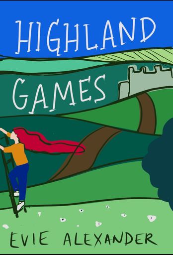
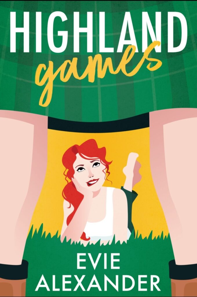
Full wrap design
Next up was the full wrap. This includes the spine and back cover and is used for the print version. This only went through a couple of tweaks and I loved the inclusion of the castle
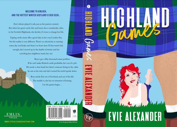
So, this is the process by which we ended up with the cover for Highland Games, an illustrated cover that immediately says fun and cheeky romance. I’d love to know your thoughts! Is it what you expected? And what would you like to see for the rest of the series? Get in touch and let me know!
Evie X
")